Skip to contentWorking with communities in the East End since 1884Donate

Digital design system

Toynbee Hall
website style guide

Official brand foundations, adapted for clear and reusable web experiences. The October campaign image informs the editorial story pattern; it does not replace the core identity.

01 / Color

Brand colors, shown in context

Use full-strength colors for accents and approved tints for broad surfaces. Each swatch shows its hex value and suggested role.

Aa
Orange#F16E00

Accent, calls to action, story features

Aa
Deep slate#1F2933

Interface text on orange, jade and pale surfaces

Aa
Grey#636466

Body text on white

Aa
Navy#175984

Headings, links, high-contrast panels

Aa
Jade#20A790

Supporting accent

Aa
Light blue#96B4DE

Supporting panels

Aa
Yellow#EEB736

Highlights

Aa
Black#000000

Core brand color; reserved from interface copy

Aa
White#FFFFFF

Page backgrounds and reverse text

Aa
Orange tint#FFF0E3

Soft story and callout surfaces

Aa
Jade tint#E4F6F2

Newsletter and community surfaces

Aa
Light blue tint#EDF3FB

Quiet information panels

Aa
Yellow tint#FFF6DF

Soft highlight surfaces

Accessible combinations

Deep slate on orangeBody text and buttons · 4.9:1
White on navyLarge panels and calls to action
Grey on whiteLong-form body copy
Deep slate on jadeBody copy on accent panels · 4.9:1

Use deep slate for body text and button labels on orange and jade. Reserve white text on those colors for large headlines. Aim for 4.5:1 contrast for normal text and 3:1 for large text.

02 / Typography

Outfit, with a clear voice

The examples below use the actual web font and weights used by the site.

300 · Light

People and communities can thrive.

400 · Regular

People and communities can thrive.

500 · Medium

People and communities can thrive.

H1 · 64 / 46px

Change starts here

H2 · 44 / 34px

Stronger communities

H3 · 24px

Advice that makes a difference

Body · 16–18px / 1.5

We work alongside people to build a fairer future, with practical support, learning and community action.

Small label · 14px

NEWS · COMMUNITY · IMPACT

03 / Components
Reusable patterns in the system

Primary actionExplore our work ↗
Reverse actionFind out more ↗
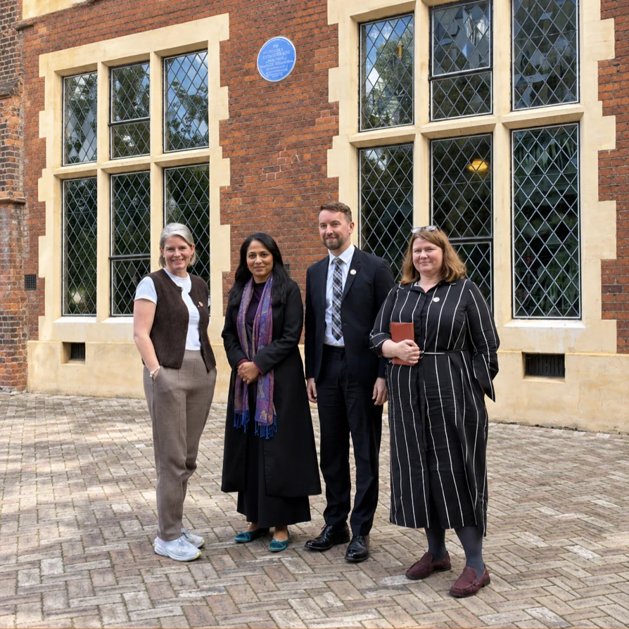
Toynbee Hall team welcoming Rushanara Ali MP outside the Hall
Editorial story · Orange

Welcoming Rushanara Ali MP to Toynbee Hall

A visit to share our work and research with local partners.

Service card · Pale tint

Advice and support

Practical help, shaped around the person and their circumstances.

Explore support ↗

04 / Use with care

Accessible by design

  • Body copy stays at least 16px.
  • Interactive targets are at least 44px where practical.
  • Keyboard focus uses a visible 3px navy outline.
  • Informative images have meaningful alt text.
  • Use approved logo artwork on white with clear space.